- Published on
Indie Dev Weekly #14
- Authors
- Name
- WANG Shudao
- @iVulgur


2023,0515-0521
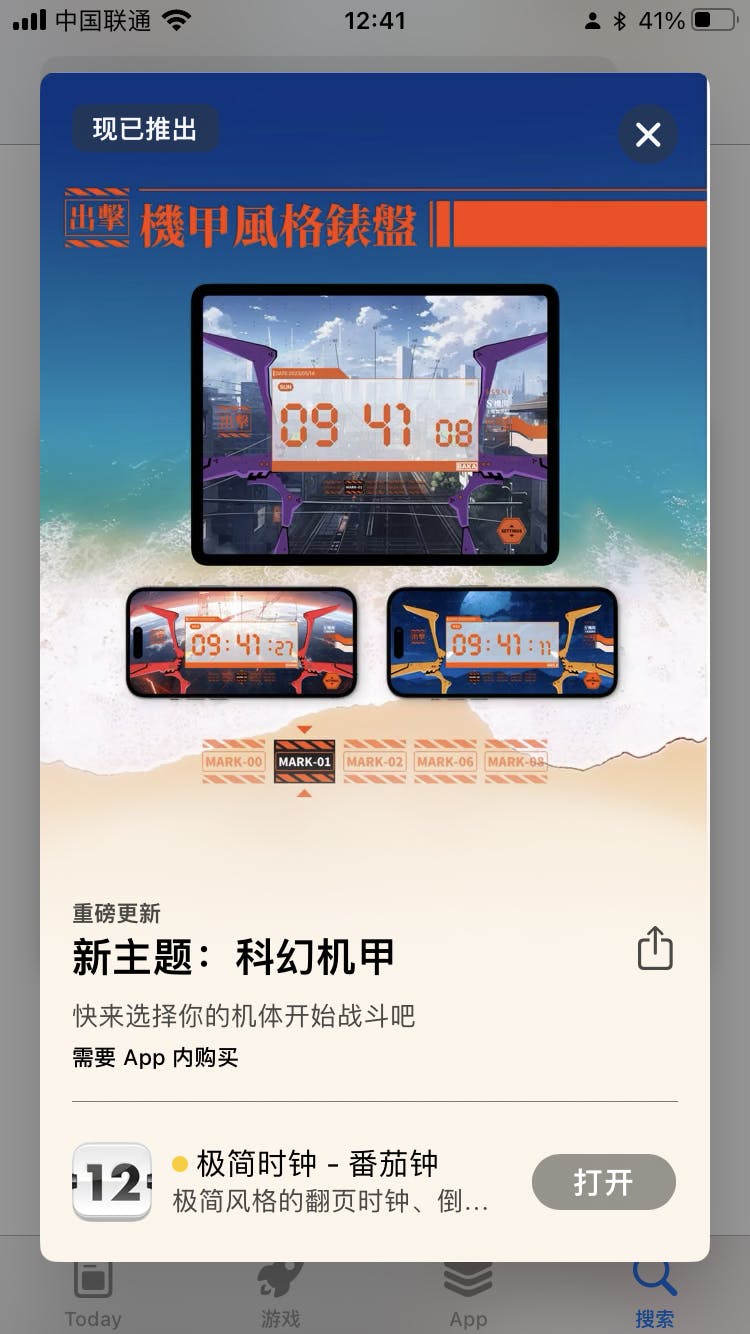
In this issue, I will only talk about one thing, which is the brand new version of the Zen Flip Clock that was just released on the App Store.

Zen Flip Clock (App Store)
After 50 days of design and development, the new version 4.3.0 is finally available on the App Store, and I'm here to share the story behind this version.
Origin
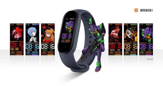
If you are an anime enthusiast, then I believe you can immediately recognize the inspiration behind this design from which classic animation.
I am a long-time fan and enthusiast of this animation and have always wanted to create a clock based on this theme. Initially, my idea was simple, just like other collaborative designs, to use the classic colors and elements of the mecha to create a set of watch faces.
Coincidentally, the designer is also an avid fan of this animation, and when I told him about my idea, he instantly agreed.
Design
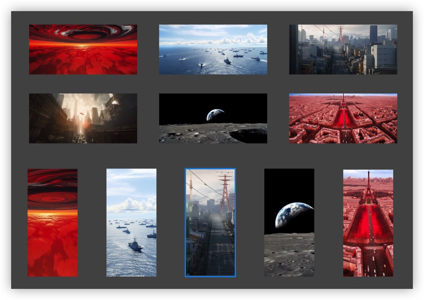
Initially, I also thought the designers would have similar ideas as me, just designing a few watch faces based on the classic color schemes of a few mecha. The design in the image below represents the limit of my imagination.

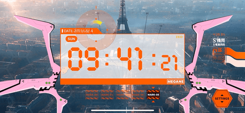
However, a few days later, the designer presented a design proposal that astonished me: the cockpit perspective. This unprecedented design perfectly combines digital clocks, mecha, cockpit HUD, and battle scenes.
Full of details
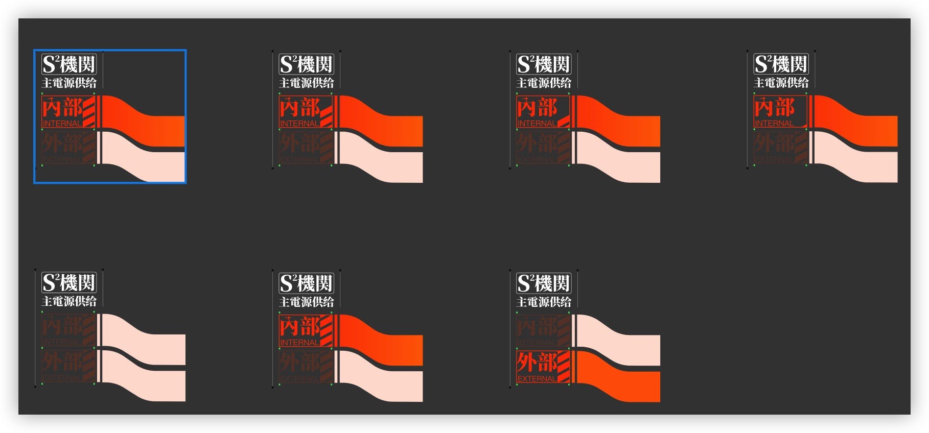
For this version, the designers reviewed the entire animated series again and conducted in-depth research on the design style in it, striving to capture that essence. Many details of the elements can only be discovered when enlarged. Unfortunately, these details cannot be found carefully in the app due to the size problem.

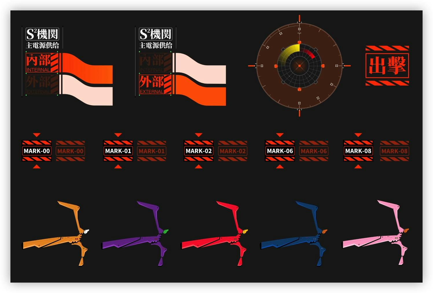
In addition to the graphical intricacies, we spent a considerable amount of time selecting and adapting the Chinese characters and numbers used in the design. In the selection of free commercial fonts, we had to make some compromises to achieve the perfect design. Initially, I reused digital-themed numeric fonts, but the designer felt they didn't fit well and we went through two or three replacements before finally settling on the current choice. As for the Chinese characters, our final selection was based on the serif style that best captured "that essence."

Background Images
All the background images were generated by Midjourney. We had a video conference session overnight to match each battle scene of the mecha with a corresponding background image.
Although I really liked these images, when we actually put them in the app, they didn't match well with the cockpit and HUD. In the end, we abandoned them, and the images currently in the app are from the second version.

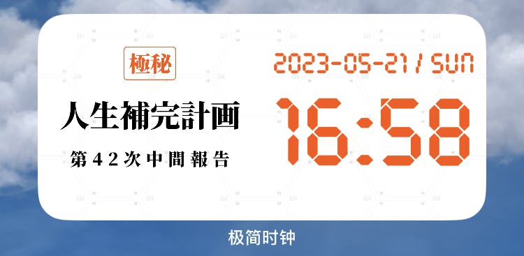
Additionally, the background images for in-app events were also generated by Midjourney, all featuring iconic scenes. I wonder if you have noticed it? 😜
Interaction
When the design draft of this version came out, I immediately noticed that there was plenty of room to improve the interactivity of this watch face.
Previously, the interactivity of the previous watch faces was mainly functional, such as switching between 12/24 hours, showing/hiding seconds, and so on. However, the interactivity in this new watch face was designed to simulate the perspective and operations of a mecha pilot. As a result, we incorporated three-axis gyro monitoring into the app.

From the gif above, you can see that the background image can make slight movements based on the device's motion and rotation. Initially, the design included 3D deformation, but it was removed as the effect was not ideal. We also envisioned creating a 360-degree surround VR effect for the entire background, but due to time constraints, we didn't delve deeper into it. Perhaps it will be added in the future.
The framework of the cockpit can change its angle according to the device's tilt and have some lateral displacement when the phone is horizontally rotated. When switching mechas, the cockpit also has transition animations and sound effects.
The main elements on the HUD include the "strike" button, power indicator, mecha switch button, and settings button. Clicking the "strike" button triggers a randomly moving crosshair. The power indicator has corresponding animations and sound effects when the device is connected or disconnected from power. Additionally, when not connected to power, it displays the current remaining battery level and a five-minute countdown.

Regarding sound effects, we spent several days searching for and creating various sounds: the sound of switching seconds, the sound of clicking different buttons, the sound of power switching, and the sound of mecha switching. To further enhance the atmosphere, we plan to incorporate Apple Music in the next version.
But what about simplicity?
You might ask, isn't the app called "Zen Flip Clock"? Isn't this design not very minimalist?
Answer: Yes, this design indeed deviates from the previous minimalist design of Zen Flip Clock, but it was a moment of indulgence for us to pursue our dream.
However, within this design concept, we still kept one minimalist aspect, which are the timers.

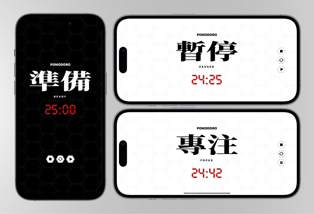
Initially, the pomodoro timer and countdown timer pages had the same cockpit design as the clock page, but with three additional control buttons and some different text. This design approach made development very convenient for me because I had previously modularized and encapsulated the entire cockpit page, making each element reusable. Therefore, it only took me a little over two hours to complete the development of the pomodoro timer and countdown timer.
However, last Sunday, when I thought the development was all done, the designer presented the above design draft, and I immediately felt it was particularly suitable for the timer page. So, I decided to abandon the previous design and adopt this new one.
Conclusion
The designer initially thought I wouldn't be able to implement their design, and I also had some doubts at first. Fortunately, the final result turned out quite well.
Through the design and development of this version, the designer and I reached a consensus: to create more cool and fun clocks based on the foundation of "minimalism." We have already come up with several exciting design ideas.
If you are interested in the new design of Zen Flip Clock, feel free to download and use it, App Store.